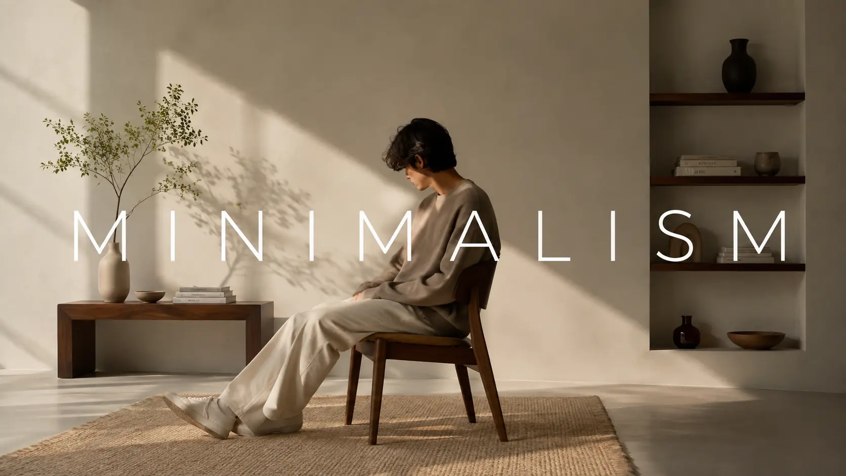
Minimalism is one of the most misunderstood ideas in design. People see a clean white page with one bold word and think, that must have been easy. It was not. Behind every great minimalist design is a process of subtraction so deliberate it borders on obsessive, a designer asking, again and again, does this element earn its place?
The paradox of minimalism in design is that it demands more from a designer, not less. When you strip away the decorative scaffolding, everything that remains is exposed to the viewer's full attention. There is nowhere to hide a weak composition, an unclear hierarchy, or a forgettable idea. That is precisely what makes it so powerful and so challenging to get right.
What Is Minimalist Design?
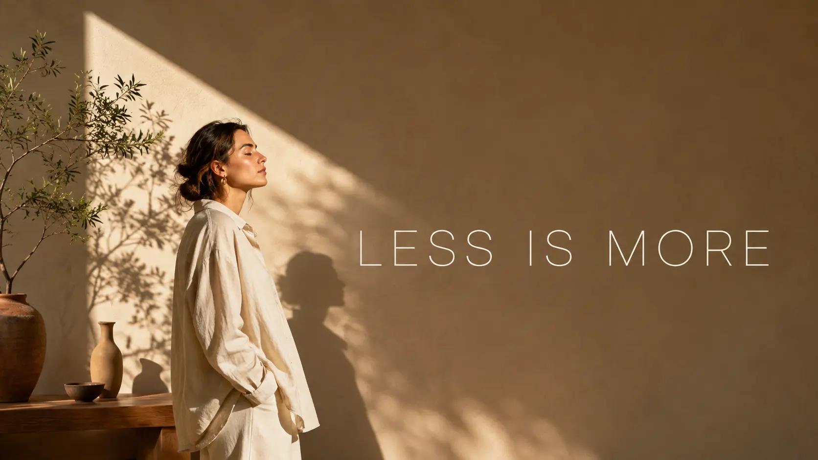
Minimalist Design
Minimalist design is the practice of reducing a design to only its most essential elements, removing everything that does not directly serve the message, the function, or the user. It is not a style in the decorative sense. It is a discipline of intentional subtraction.
This philosophy applies across every medium: websites, logos, interiors, print, and product design. Its core conviction is that clarity, not complexity, creates impact.
The phrase most associated with the movement is "less is more," a line attributed to architect Ludwig Mies van der Rohe, who became the final director of the Bauhaus before its closure in 1933. The Bauhaus school was one of the earliest and most influential incubators of the minimalist design philosophy, insisting that beauty and function were not opposites but the same thing pursued rigorously.
In the mid-20th century, the Swiss International Typographic Style (or Swiss Style) formalized these ideas into a visual language. Characterized by clean grid systems, sans-serif typefaces, asymmetric layouts, and heavy reliance on white space, Swiss Style became the dominant visual grammar for corporate identity, editorial design, and signage across the world.
In the 1960s and 70s, Dieter Rams brought these principles into product design. His work for Braun (radios, coffee makers, calculators) embodied a philosophy: good design is as little design as possible. His influence is visible in virtually every Apple product ever made.
Today, minimalism in design is not a trend. It is a foundational approach that crosses every medium, from digital interfaces to retail spaces to brand identities. Its continued relevance comes from a simple truth: in a world of relentless visual noise, clarity is a competitive advantage.
Benefits of Minimalist Design
Faster load times: Fewer elements mean leaner pages that load quicker and rank better in search.
Reduced cognitive load: Simpler interfaces require less mental effort, keeping users focused on the primary action.
Higher conversion rates: Studies consistently show that page speed and clarity directly influence conversion; clean layouts remove friction between intent and action.
Timeless aesthetic: Minimalist work does not date the way trend-driven design does. A well-executed minimalist identity built in 2016 still reads as contemporary in 2026.
Stronger brand recall: Consumers are consistently more likely to remember a simple, clean visual identity over a complex one, because simple shapes are processed faster and stored more reliably in memory.
Minimalist Design vs Maximalist Design
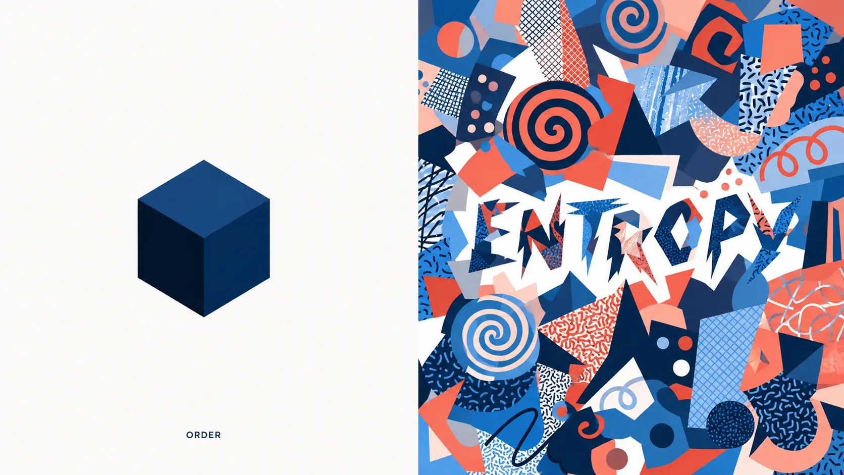
Split composition contrasting minimalist design on the left with maximalist design on the right
To understand minimalism fully, it helps to understand what it is not.
Maximalist design operates from the opposite conviction: more is more. It layers color, pattern, texture, and ornamentation to create environments and compositions that are deliberately rich, dense, and stimulating. Think Versace, the interior of a Wes Anderson film set, or a Baroque-era cathedral ceiling. Maximalism communicates abundance, personality, and intensity.
Minimalist design communicates clarity, confidence, and restraint. Think Apple's product pages, the Muji brand identity, or a well-designed Swiss magazine layout.
The difference is not just visual. It is intentional. Minimalism asks every element to justify itself. Maximalism invites every element to contribute to a whole. Neither is inherently superior. The question is always: what does this work need to communicate, and to whom?
A luxury perfume brand targeting a discerning, high-income audience may use a minimalist color palette (black, white, and a single metallic accent) to signal exclusivity and restraint. A children's toy brand targeting parents of five-year-olds will likely reach for maximalism's full arsenal of color and playfulness.
Context is everything. In a busy social media feed saturated with maximalist imagery and bold colors, a clean minimalist graphic can stop a scroll precisely because of its calmness. Conversely, in an interface designed with clinical whiteness, a single rich image can feel dramatic and arresting. Each style is most powerful when deployed with knowledge of its opposite.
What both share is the requirement for intention. The worst maximalist work is cluttered. The worst minimalist work is cold and confusing. The goal in either direction is coherence.
The Misconception: Minimal Does Not Mean Empty
The single most persistent mistake people make when attempting minimalist design is confusing minimal with bare. They remove elements, strip away color, reduce typography to one weight, and end up with something that feels unfinished, like a sketch that never became a painting.
Minimalism is not the absence of design. It is the presence of only the right design.
Consider the FedEx logo. On its surface, it is clean, simple, two-color corporate typography. Nothing unusual. But between the E and the x, there is a hidden arrow, a piece of negative space so deliberate and perfectly constructed that it has become one of the most studied pieces of logo design in history. That arrow does not announce itself. It rewards attention. The design is minimal on the surface, but dense with craft underneath.
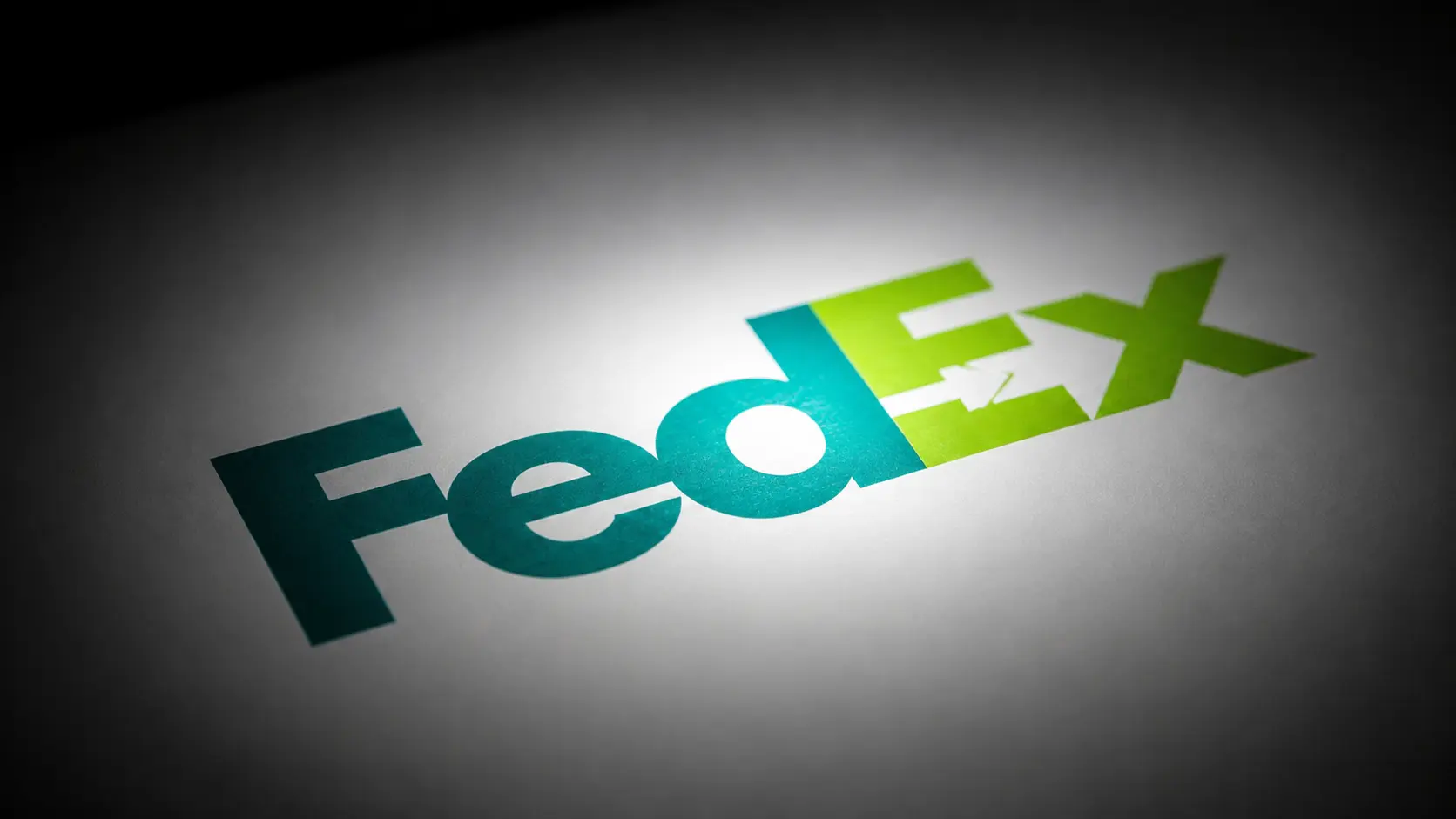
Close-up of FedEx logo highlighting the hidden arrow in negative space minimalist design is not empty
Or consider a great minimalist poster: a single image, a single line of text, acres of white space. What makes it work is not the emptiness. It is the relationship between the image and the type, the weight of the chosen font, the exact proportion of white space to content. Every decision is load-bearing. Great minimalist designers are not making fewer decisions. They are making the same number of decisions, but each one carries more consequences.
This is the paradox that beginners miss: minimalist design is harder than complex design because there is no excess to hide behind. When you reduce a composition to three elements, each of those elements must be perfect. The white space is not nothing. It is an active force, shaping how the eye moves, what it notices first, and how long it lingers.
Try Nano Banana 2 for Minimalist Design
The Core Principles of Minimalist Design
Every field that practices minimalism (graphic design, UI design, architecture, fashion) operates from a shared set of underlying principles. Master these, and the specific techniques become intuitive.
1. Less Is More
The foundational principle. Every element you add to a design introduces visual weight, impacts balance, and asks something of the viewer's attention. Before adding, ask what you can remove. Before keeping something, ask what would be lost if it were gone. If the answer is nothing, remove it.
2. White Space Is a Design Element
White space in design, also called negative space, is not empty. It is the counterpart to everything visible. It creates breathing room, establishes hierarchy, signals sophistication, and guides the eye.
Macro white space shapes the overall layout: margins, section gaps, padding around hero images. Micro white space governs readability: line height, letter spacing, padding inside buttons. A design that treats white space as wasted space will always feel cluttered, regardless of how few elements it contains.
The distinction matters when generating minimalist visuals with AI. A prompt that specifies the exact proportion of negative space, the position of the subject within it, and the direction of the eye's intended path produces cleaner results than a prompt that just asks for "minimalist" style. Google's Nano Banana 2 model is particularly good at honoring these spatial instructions when they are described precisely, which is what makes it a natural fit for typographic minimalist work where negative space is doing most of the composition work.
The other reason white space matters at the prompt level: AI image models trained heavily on cluttered stock photography and busy internet imagery tend to fill empty regions with detail unless told not to. Explicit negative-space instructions in the prompt (specifying that the top half of the frame should be empty, or that the background should be a solid neutral tone with no visual detail) prevent that default drift and produce genuinely minimalist output rather than reduced-but-still-busy output.
3. Visual Hierarchy Does the Heavy Lifting
When you remove most visual complexity, hierarchy becomes the primary navigation system. The viewer's eye needs to know where to go first, second, and third. In minimalist design, hierarchy is established through scale, weight, contrast, and, critically, white space. A large headline surrounded by generous negative space will command attention even on the most stripped-back page.
Hierarchy is what separates a minimalist design that guides from one that confuses. Without ornamental cues, the viewer relies entirely on relative sizes, positions, and emphasis to understand what matters most. Get that hierarchy wrong and even a beautiful composition will fail to communicate.
4. A Restrained Color Palette
A true minimalist color palette typically works within two to three colors, often anchored by neutrals (white, black, grey, or warm off-whites) with one accent color used strategically. This restraint is not timidity. It is precision. When color is rare, it carries weight. A single red dot on a black-and-white composition will pull the eye with magnetic force. That is the power of using color sparingly.
The palette should be decided before any composition work begins. Trying to add color restraint after the fact almost always produces designs that feel restricted rather than intentional. Committing to the palette at the start gives every subsequent decision a clear boundary to work against.
5. Typography Carries the Message
In minimalist design, when imagery and ornamentation are reduced, typography steps forward. I must work harder. A well-chosen typeface can carry an entire brand identity, set an emotional tone, and establish hierarchy all at once. Minimalist typography tends toward clean, geometric sans-serifs (Helvetica, Futura, Gill Sans) or, at the other end, elegant serifs with strong personalities. The key is commitment: choose one or two typefaces and use them with discipline.
For designers producing minimalist type-led visuals with AI generation, text rendering precision matters more here than in almost any other style. A typographic minimalist poster with malformed characters is not minimalist. It is broken. This is where Nano Banana 2's industry-leading text rendering pulls ahead of general-purpose image models.
6. Every Element Earns Its Place
The final and most important test. Before any design is finished, every element on the page should be interrogated: Why is this here? What does it do? What would happen if it were removed? If it cannot answer clearly, it goes.
This test is what most beginners skip and most experienced minimalists apply relentlessly. The instinct to leave something in "just in case" is the enemy of good minimalist work. If an element is not actively contributing, it is passively subtracting.
How to Design With Minimalism: Step-by-Step
Knowing the principles is one thing. Applying them to a blank canvas is another. Here is a practical process for how to design with minimalism and make it work.
1. Start With Content, Not Aesthetics
Minimalism begins with knowing exactly what the design needs to communicate. Before touching a single visual element, write out the message in plain language. What is the one thing a viewer must understand or feel? Everything in the design should serve that answer.
If you cannot state the message in one sentence, the design will not be able to communicate it in one glance either. Rewrite the sentence until it is unambiguous. That sentence becomes the brief the design has to answer.
2. Choose Your Color Palette Before Anything Else
Open your project with a color decision already made. Two to three colors maximum. Anchor the palette with a neutral (white, off-white, or a deep charcoal) and introduce one accent color with a clear purpose. This constraint will force every subsequent decision into alignment.
3. Select One Primary Typeface, One Secondary
A minimalist approach applies equally to typography. One display face for headlines. One workhorse face for body copy. Set your type scale (headline sizes, subheading, body, caption) and do not deviate from it. Consistency in type is what separates polished minimalist work from amateur attempts.
4. Work on a Grid
A grid is the invisible architecture that makes everything feel intentional. Even asymmetric minimalist layouts are built against a grid they knowingly break. Use a standard 12-column grid for web, or construct a baseline grid for print. The grid ensures that your white space is proportional, not arbitrary.
5. Place Your Most Important Element First, Then Build Outward
Put your primary visual or headline down first. Give it breathing room. Add your second element and observe how the relationship feels. Keep adding only what is necessary. If adding an element makes the composition feel more complete, it stays. If it makes it feel busier, it goes.
6. Audit the Finished Design Ruthlessly
Step back and look at the whole. Ask, one more time: what can be removed? Shrink the decoration. Widen the margins. Reduce the number of type weights. Trust the white space. The first pass at a minimalist design is rarely minimal enough.
For designers building repeatable AI-generated minimalist workflows, our JSON Prompting for AI Image Generation covers the structured prompt approach that produces the most consistent minimalist visual output across a series.
Design With Nano Banana 2 Free
Minimalist Design by Medium
Minimalist Web Design
Minimalist web design is defined by fast-loading, uncluttered layouts that prioritize user experience over visual spectacle. White space is used generously. Navigation is simplified, sometimes reduced to a hamburger menu or hidden entirely. Color is used sparingly, and imagery, when present, is large and purposeful.
The UX benefits are measurable. Simpler interfaces reduce cognitive load, the mental effort required to process a page. Cleaner layouts consistently correlate with better conversion metrics because they remove friction between the user's intent and the primary action. Google's homepage remains the definitive example: one logo, one search bar, two buttons. That layout has changed remarkably little in 25 years, and its consistency is precisely the point.
If you want to apply minimalist principles to visual content creation, tools like the AI Image Editor and Nano Banana 2 image generation let you build clean and intentional visuals without the noise, stripping the process down to exactly what the image needs to say.
Minimalist UI Design

Smartphone screen displaying a minimal app interface with generous white space and two-color palette minimalist UI design example
Minimalist UI design applies the same philosophy to application interfaces. The goal is to eliminate every element that is not directly helping the user complete their task. This means reducing menu options, hiding secondary functionality behind progressive disclosure, and using iconography carefully.
The key tension in minimalist UI is between simplicity and usability. Strip too much and users become lost and confused by the absence of visual cues, unable to navigate between sections. Apple's Human Interface Guidelines and Google's Material Design both represent sophisticated minimalist UI frameworks that manage this tension through consistent spatial rhythms, clear hierarchy, and deliberate use of motion.
Designing a repeatable minimalist UI workflow is easier when the tooling supports it. AI image generation lets you systematize your visual decisions, so your palette, spacing, and component choices stay consistent across every screen you build. It also lets teams prototype minimal interfaces quickly, letting you stress-test hierarchy and spacing decisions before committing to a full build.
Minimalist Graphic Design
In minimalist graphic design (posters, editorial layouts, packaging, brand collateral) restraint becomes a creative act. The designer works with a small set of elements and uses the relationship between them to generate meaning and emotion.
The strongest minimalist graphic work tends to carry a conceptual idea: the negative space in the FedEx arrow, the absent body in a Saul Bass film poster, the single overscaled letter that turns typography into image. Reduction is not the goal in itself. It is the method through which an idea is made more powerful.
For designers using AI generation to iterate on minimalist graphic concepts quickly, Nano Banana 2's precision editing capabilities and text rendering quality make it particularly well-suited to typographic minimalist work, editorial layouts, and packaging visuals where every element must render exactly right.
Minimalist Logo Design
Minimalist logo design is perhaps the most commercially proven application of the philosophy. Consumers are consistently more likely to remember a simple, clean logo over a complex one, because simple shapes are processed faster and stored more reliably in memory.
Nike's swoosh communicates speed, motion, and athletic energy with a single curved line, designed in 1971 for $35. Apple's bitten apple, refined to a monochromatic silhouette under Steve Jobs in 1998, became one of the most recognized marks in history. In both cases, simplicity was not the starting point. It was the destination after everything superfluous had been removed.
For minimalist logo design, the practical principles are: geometric shapes and clean lines, limited color (often one or two), confident use of negative space, and a single, clear concept that survives reproduction at any size. For designers and brand builders looking to test minimalist concepts quickly, AI image generation lets you iterate on clean, stripped-back mark ideas without the overhead of building each variation from scratch. Isolating and refining specific mark elements benefits from a clean workflow, which is where the Background Remover fits directly into logo iteration.
Minimalist Interior Design
Minimalist interior design extends the same philosophy into physical space. Rooted in Japanese aesthetic traditions (particularly wabi-sabi, the appreciation of simplicity and imperfection) and in Scandinavian functionalism, minimalist interiors prioritize open space, natural materials, and a strict edit of what is allowed in the room.
Key principles: a neutral base palette, furniture selected for both beauty and function, the elimination of visual clutter, and the deliberate use of a single accent (a piece of art, a plant, a textured throw) to introduce warmth without chaos. The goal is a space that feels considered, not sterile.
For interior designers producing concept visuals of minimalist spaces before committing to physical changes, AI image generation is particularly well-suited to this work because minimalist interiors have relatively few elements to render, which means fewer opportunities for the model to produce visual noise or confused details. The clean, restrained aesthetic maps directly to what the strongest image models are best at producing.
Minimalist Design Ideas and Examples
The best way to internalize minimalist design principles is to study work that executes them brilliantly.
Apple's product pages remain the gold standard for minimalist web design: a single product image on a white background, a headline in one weight of San Francisco, and enough white space to make the product feel like an object worth considering seriously. The consistency across every product page over more than two decades demonstrates how minimalism, when built into a brand's operating system, compounds into a distinct visual identity.
Muji's brand identity applies minimalism to retail at every touchpoint: packaging, store layout, visual communication. This creates a coherent aesthetic of "no-brand" that paradoxically became one of the world's most recognizable brand identities. Muji is proof that minimalism at scale is not about the absence of a brand voice. It is a very specific, very consistent voice that says the same thing across every touchpoint.
Dieter Rams' Braun T3 pocket radio is one of the most cited minimalist design ideas in product history: a rectangle, two knobs, a dial, and nothing else. It inspired the original iPod so directly that the two objects are almost indistinguishable in silhouette. The Braun T3 is now a case study in every design school in the world, taught as an example of how form follows function only when every function has been considered rigorously.
Saul Bass's film posters for Vertigo, Anatomy of a Murder, and The Shining show how minimalist graphic design can generate psychological tension from the simplest possible imagery. A tilted spiral. A figure without a face. A single jagged line. Bass understood that emotional impact in minimalism comes from what the viewer projects onto the negative space, not what is drawn into it.
For your own work: study these pieces not as things to imitate, but as problems solved. Ask what decision was made at each step, and why. This kind of analytical study is often more useful to a working designer than practicing new techniques. For a broader framework on presenting your design work strategically, our How to Create Design Portfolios guide covers how minimalist principles apply to portfolio presentation itself.
Common Mistakes to Avoid
Here are the common mistakes designers make when working on minimalist designs.
Confusing bare with boring: Removing elements is not the same as making decisions. A blank page with a single line of body copy is not minimalist. It is unfinished. Every element that remains must be chosen with purpose. Removal is only the first half of the process. Composition of what stays is the second half, and it is where most amateur minimalist work fails.
Neglecting contrast and hierarchy: When everything is the same size, weight, and color, nothing stands out. Minimalism still requires hierarchy. Use scale and weight to signal importance, even if your palette is limited.
Treating white space as wasted space: White space is not nothing. When a client or colleague says "there's too much white space," the answer is to explain what it is doing: creating emphasis, signaling premium quality, giving the eye room to rest. This is one of the most common client pushbacks minimalist designers face. Being able to defend white space as an active design decision, not a shortage of content, is a career skill worth developing early.
Removing too much: Minimalism can become unusable when it sacrifices clarity for aesthetics. Hidden navigation, icon-only menus, and the removal of labels are common culprits. Always test with real users. If they cannot find what they need, the design has failed, regardless of how clean it looks.
Ignoring texture and warmth: Particularly in interiors and branding, pure minimalism can feel cold or clinical. A single natural material (linen, wood grain, matte ceramics) introduces warmth without visual complexity. In digital design, this translates to subtle texture, soft shadows, or a single natural photograph placed carefully within an otherwise reduced composition.
Chasing minimalism as a trend rather than a solution: The final and most subtle mistake: adopting a minimalist aesthetic because it is fashionable rather than because it serves the brief. If your product is genuinely rich and playful, minimalism will suppress rather than communicate its personality. Minimalism is the right answer often, but not always. Choose it because it fits the message, not because it fits the moment.
Ready to Create Minimalist Design With Templix?
Minimalism is not a shortcut. It is the longest route to clarity, one that requires you to know your message completely, choose every element with absolute purpose, and trust that what you leave out is doing as much work as what you keep.
The principles are simple to articulate and genuinely hard to practice. Less is more, but only when every element that remains is more than enough. White space is not empty, it is the medium through which everything visible becomes meaningful. Minimalist design is not about making things look clean. It is about making things work.
Whether you are designing a website, a logo, a poster, or a room, start with the same question: what is the one thing this needs to communicate? Then build only that. Remove everything else. Trust the space.
The most powerful minimalist designs in history are not remarkable for what they contain. They are remarkable for the precision, discipline, and conviction of what they removed.
Start Creating Minimalist Designs Free
Frequently Asked Questions
What is minimalist design?
Minimalist design is the practice of reducing a design to only its most essential elements, removing everything that does not directly serve the message, the function, or the user. It is built on the conviction that clarity, not complexity, creates impact.
What are the core principles of minimalist design?
The six core principles are: less is more, white space as a design element, visual hierarchy, a restrained color palette, purposeful typography, and the rule that every element must earn its place. Together they form a discipline of intentional subtraction rather than a visual style.
What is the difference between minimalist and maximalist design?
Minimalist design strips away everything non-essential and communicates through restraint, clarity, and white space. Maximalist design layers color, pattern, texture, and ornamentation to create richness and intensity. Neither is superior. The right approach depends on what the work needs to communicate and to whom.
How do I start designing with minimalism?
Start by defining the one thing your design needs to communicate. Then choose a color palette of two to three colors, select one or two typefaces, work on a grid, and place your most important element first. After each addition, ask whether it makes the composition clearer or busier. Audit the final design and remove anything that does not earn its place.
Is minimalist design still relevant in 2026?
Yes, and increasingly so. As digital environments become more cluttered and attention spans shorter, minimalist design's ability to communicate quickly and clearly becomes a competitive advantage. It also performs better technically: minimalist websites load faster, reduce cognitive load, and tend to convert at higher rates.
What makes a good minimalist logo?
A strong minimalist logo uses geometric shapes and clean lines, limits color to one or two choices, uses negative space deliberately, and communicates a single clear concept that works at any size. The goal is a mark that is processed quickly, stored reliably in memory, and remains effective across every medium and application.
How can AI help with minimalist design?
AI image generation tools like Templix Nano Banana 2 handle text rendering, negative space, and precise composition at production-grade quality, which are exactly the demands minimalist design places on any visual tool. Nano Banana 2 is particularly useful for typographic minimalist work, logo iteration, editorial layouts, and product visuals where every rendered element must be exactly right rather than approximately right.
Is Templix Nano Banana 2 free to use?
Yes. Templix offers free credits on signup so you can test Nano Banana 2 at no cost. Paid plans unlock higher credit volumes and priority processing for designers producing minimalist visual work at scale.
Can Nano Banana 2 output be used for commercial minimalist branding?
Yes. Images generated on Templix are yours to use, including commercial applications, print, packaging, and brand identity work. This makes the model suited for designers building minimalist logo systems, packaging visuals, or campaign imagery for real client work.
What Templix tools work best alongside minimalist design work?
For minimalist design specifically, the most useful combination is Nano Banana 2 for generation and precision editing, the Templix Background Remover for isolating clean mark elements, and the creative suite for the broader production pipeline. Together they cover most of the visual work a minimalist designer needs to produce for real client briefs.

Sana Iqbal
Sana Iqbal writes on marketing and design for Templix, focusing on AI-powered apps and campaigns that help creators grow audiences and scale their content.